GMTK Game Jam 2021 – Re-Joined

In 2020, my colleagues from my daytime job planned to participate in the GMTK Game Jam and asked if I wanted to join, too. If you aren’t familiar, the GMTK Jam is the second biggest jam around the world. It’s a game-making competition where teams of any size can put together something playable in under 48 hours, and the game should be based around a specific theme that’s only announced at the start of the jam.

Eventually, we decided to give it a go, wait for the theme announcement, then do a brainstorming session, discuss all the ideas we got, and see if we wanted to make any of them. At that time, I also worked together with a writer and an artist on a game idea, so I got them on board, too.

After a long discussion, we eventually decided to move forward with the jam and start working on the game, which 48 hours later turned out to be Waste Waster. We had a lot of fun while making it over the whole weekend, and reached a place of 973 / 5416. You can read more about the creation process here.

This year I had the thought of the GMTK Jam in my mind but I’m pretty overwhelmed with everything going on in my life so I didn’t consider joining. I just knew I wouldn’t have the mental capacity of brainstorming, planning, coordinating, designing, and coding over another full 2 days period to make a game. So I didn’t actually note down the dates of the jam.

Fast forward to last Friday, I learned that the Jam is taking place over the weekend. I already had plans for Sunday so I knew I wouldn’t be available, but still, I was interested to see what theme this year’s jam will have, so after the announcement video premiered, I tuned in to find out the theme will be “Joined-Together”.


I’ve never been a huge fan of puzzle games, but lately, I started enjoying them. I already finished The Witness and recently got all endings in The Talos Principle. So maybe because of that, after seeing the theme I already got a simple puzzle game idea in mind, where the player can control two different characters, which react to the same input differently: while one character performs the moves as they were pressed, the other one is doing the exact opposite. And as an extra twist, the goal of each level would be to rejoin the characters at the same position, in the center of the level. It’s always nice to not only have the theme in your core gameplay mechanics but also in your setting, too.

Although the game is pretty simple, I knew I wouldn’t have the time to fully make it in only one day, especially since I wanted to put some more focus on designing and balancing the levels instead of programming this time. So I reached out to an old friend and ex-colleague of mine and asked him if he wanted to participate. The last time we worked together was 5 years ago, so we can say we Re-Joined (hah!) our forces once again. He was free on Saturday, so I quickly pitched him the idea, and then we decided to make the game in under a single day, and whatever the result will be, we will go with it.

On Saturday morning I started with looking at all the 2D tile maps I collected over the past years. I usually buy stock art in various sales as they usually come in handy for prototyping ideas, and it’s always more satisfying to look at properly drawn assets compared to blocks and circles. I was looking at two different settings: I wanted to make a game where the two characters were past and future selves of the same player, while the other idea I had was much more approachable: a boy lost his dog in the forest and they need to find each other. Eventually, I found I have more assets to support the forest setting, so I loaded up the tilemap and started painting a level.

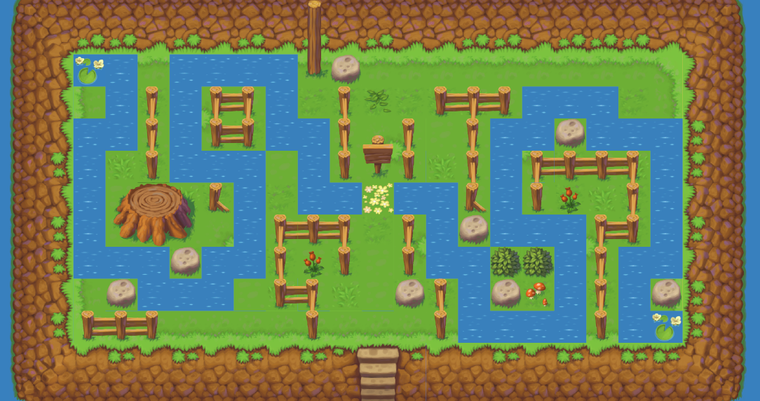
For level creation, I went with the simple idea of using separate layers of tilemaps. I first placed the two start positions (marked with the water lilies), then created the optimal path I expected players to follow (marked with the water tiles). While developing these paths I also had the option to define what type of challenge I want players to face. Once I got the paths figured out, all I needed to do was to add the obstacles to the level.

re joined editor screenshot

I had three different challenges I wanted players to face in this short demo of 5 levels.

1: The first two levels are pretty straightforward. The idea here is that each character has more space to go to, and none of them is restricted to a single path. However, when looking at both sides of the level at the same time, only a single path can be taken. So these levels essentially demonstrated the idea that a player needs to look at both sides of the screen and “overlap” the two different levels on top of each other to find the right path. 

2: The next two levels present the idea of the two characters not moving together, and that the connection in the controls can be broken. In both of those levels, one of the characters should be periodically parked in a corner or a dead-end while the other character could perform moves that won’t affect the first character. Finding where to park the characters while moving the other is the key here.

3: The last idea I couldn’t fully develop was to show that a character can move into the other character’s area to solve the level. I only made a single level here, where without moving one of the characters to the other side of the level, it’s not possible to solve it.

As I mentioned above, I really wanted to focus on designing for this jam, so I had a lot of fun creating the levels. After each level was done, I had to come up with a maximum number of moves allowed for each level. Without a max. move count, each level would be too easy, so I had to add some extra pressure to keep the tension up. After finding the right number of steps, I also added a few extras on top to compensate for possible errors, and also to add the option of finding alternative paths for each level.

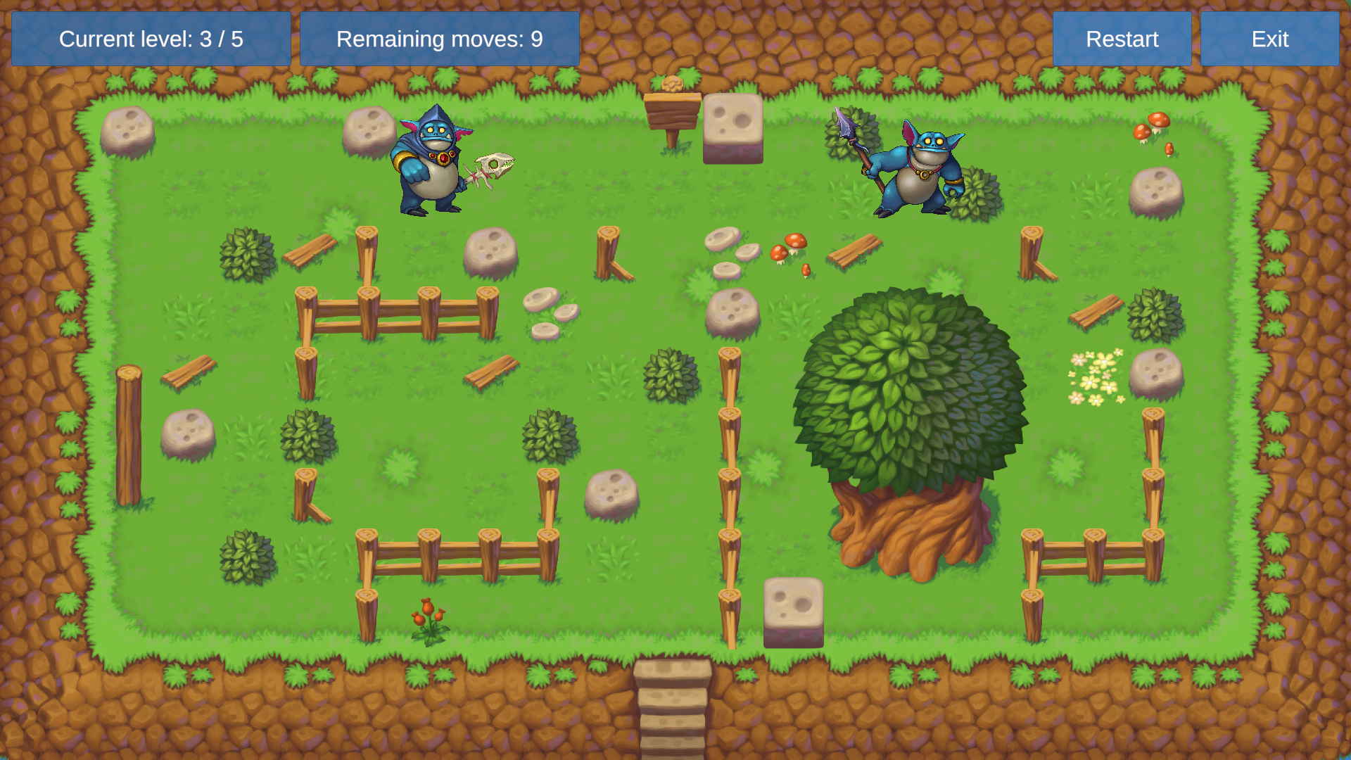
At this point, I started looking for the characters, and while I originally wanted to make the game for a boy and his dog, I couldn’t find a good dog sprite around, but I eventually stumbled upon two goblins that served a different narrative perfectly: they were patrolling the area and got lost on a tiny island. They need to find each other, and the exit, at the same time! To account for the maximum moves, I also added the explanation that they can’t stay out of the village overnight.

re joined screenshot

By the time I got all the levels done, my friend also finished implementing the core gameplay and the controls, so all I had left to do was hook up the game flow, add the UI screens and overlays, as well as to select the music and the sounds for the game. A bit before the 8 hours mark we already had the game in a good shape we were both happy with, so I went on creating the store assets and uploading the builds for Windows, Linux, and OSX platforms.

There are tons of things we could further polish both in terms of presentation (better art, nicer UI, movement effects, etc…) as well as from a mechanics point (powerup that could give additional moves, that flips the control of one character so they move at the same direction, walls that can’t be touched, etc…), but like with every jam game, it’s a matter of balancing time and resources wisely, and since we only dedicated a single day to the project, we knew we wouldn’t have time to go the extra mile of polishing or adding more gameplay elements.

By the end of the jam, a total of 5806 games have been submitted. Public voting has been open for a week, where mainly participants, but anyone else were able to play the games and rate on various categories. Based on the above voting, the game has received the following results:

Presentation: 1700
Fun: 2126
Originality: 3718
Overall: 2540

At the end of the day, we are happy with the result, and we looked forward to seeing how others will find the idea. I think ranking in the top 50% isn’t bad at all considering we only had 8 hours to spend on the project, and especially that I’ve never worked on a puzzle game before. It was a really good experience.

If you wanted to give the game a go yourself, you can check it out here: https://overheadgames.itch.io/re-joined


Winter Sale + 2020 Overview

Christmas is around the corner, and as usual, we’ll be holding our Winter Sale between 22 December and 5 January. During this period most of our packs and bundles will be available at a 25% discount. As you probably know, the autumn period has frequent sales, but once the new year begins, there usually isn’t anything for a while. So if you’ve been tempted to bag a few packs to play with later, maybe thinking ahead and grabbing them now on a discount would be the best choice for a while.
 

This year was quite extraordinary for all of us, so I wanted to look back and take some time to walk through what happened in the past 12 months at Overhead Games.

January has been kicked off with the creation of a new website. The other site was built using older technology and our needs eventually grow over its limitations. A lot of time was spent on building the current, since everything was needed to be recreated, mostly from scratch. This took quite some time and taking all the optimization that went into account probably filled a good part of February too.
 
With the new site, I took the opportunity to start writing News in a blogpost fashion so that anyone interested could keep track of what’s happened, even if they aren’t subscribers to our Newsletters. I started creating monthly Wrap-ups so we can still post an update on what’s been in the oven even though nothing major happened worth sending a newsletter for. You can find these Wrap-ups in the News section: 
 
 
In March, Throne Lady #2 was released, and we also held our 6th Birthday, where we sent out a free pack to all subscribers in our Newsletters.
 
In May, after long years of waiting, we finally released the option to export the characters as layered PSD files. We wanted to make sure we are providing this option the most optimal way possible for our users, so we had a detailed questionnaire prior to the release, where we asked our Pro users to discuss potential pricing and the form of release. We were really happy to see so many replies and we were confident we’ll provide the exporter in a way that most of our users will be happy with.
We also released ePic Character Generator on itch.io at the same time. While I wanted to provide the best, integrated experience for users checking out the software there, I failed to get the attention of the support team, so I was unable to properly configure the options for users to purchase packs on itch.io directly. As a result, all transactions will still go through our website similar to how it’s done in the standalone client.
 
In June, the male pair of the Throne Lady, the Throne Savage was released. It was interesting since this was the first package where we provide full coloring options for the skin, and as a result, even with a single base character, lots of exciting personalities can be created.
 
In August we took a little side-trip, and since I’ve been working with new people on my next project, we decided it’d be a good experience to participate in the GMTK Game Jam, and make a game in under 48 hours around a theme specified by the organizer. While the originality of the game ended up in the top 10%, our overall score only put us in the first 20% of the participants. Nonetheless, we were happy with these results. If you are interested, you can read a more detailed post on how we approached the jam here: https://overheadgames.com/gmtk-game-jam-2020-waste-waster/
Waste Waster Gameplay
At the end of August, I took a look at RPG Scenery, an exciting way to visualize scenes during role-playing. You can read my experience, as well as try the software for yourself following the links here: https://overheadgames.com/rpgscenery-a-quick-way-to-illustrate-scenes-and-battle-maps/
 
Since September, only a small amount of time was spent working on ePic Character Generator. I fixed a few issues that were reported earlier both in the client and on the website, while also participating in various sale events on Steam.
 
In November, the Fantasy Starter Bundle debuted in the Humble Store, which is a huge milestone for us! Getting into the Humble Store is not easy, since they are very selective on what they allow into their storefront. Thanks to all the users that were using the Steam version over the past years, and especially those who decided to write reviews on the store page, we were able to demonstrate that people are happy with the software, and eventually get listed.
 
I also got into my first sponsoring deal with The Games Tavern, as I offered a few keys for lucky viewers of their streams. I also got interviewed by Reid, and we talked about how I became a programmer, why we decided to create ePic Character Generator in the first place, and what’s coming next.

In December, the official Overhead Games discord server has finally been launched. It’s brand new, but there are lots of things to do already. First, you can hang out and chat with us, enjoying our company. While we can discuss any topic on your mind, or play games together, we’ll also share updates and sneak-peeks there first.

You can also play various games, like russian roulette, blackjack, participate in cute animal-races or simply bet on a coin flip, just to name a few. With all these games, you can collect Gold, a digital currency on the server, that you can later exchange for various goodies. As of now, there are already several Steam keys for various games, as well as ePic Character Generator packages available. You can also offer your own digital items on the marketplace, and obtain more Gold in the process. Both the list of available goodies as well as the games will be extended later on. In the past two years, I wrote numerous games for discord on a friend’s server, and we’ve had extreme fun playing these over the months. Since the architecture of the bots is a bit different, it’ll take some time for me to port these, but they are coming!

But that’s not all! You can also participate in a fully-fledged, text-driven idle RPG, where you can go on adventures, obtain loot and money, level up, upgrade items, form or join guilds, battle others for fame and glory, and many many more activities await you! So come, join us: https://discord.gg/ntG95jFV79

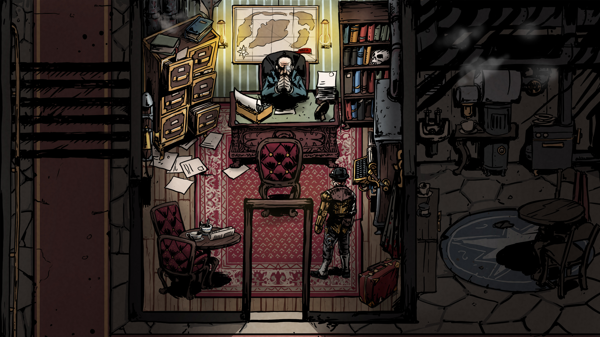
But this is not the end of the story yet. As I mentioned, since September most of my time was not spent with ePic Character Generator, as I’ve been working on a new game for quite some time now. The original idea came in April 2019, and ever since I’ve been on and off the project whenever I found the time. I started working on it more seriously this January, and since it’ll be a game with lots of text in it, I hired a writer to create these parts, as I’m not a good writer myself. During Autumn, I also came to a point where the high-level vision was already refined enough so I could start looking at different art directions. I looked around on various platforms to find the perfect match for my vision, and in the end, I got over 50 applications as potential artists for the game. I took several iterations with them, and in the end, I got the perfect style that’ll go really well with the setting and the mood of the world. I hope you enjoy the sneak-peek below:

Overhead Games Unannounced Game

In the meantime, I also started looking for a second designer/writer. We were able to create most of the buzz of the new world ourselves, but I felt that there’s still a missing component I wanted to put more focus on. At the time of writing, the game, from a technological point of view, is in a very advanced stage. All that is left to do now is fill it up with all the content we want to add, make the game interesting and exciting, and do lots of iterations to make it a very enjoyable experience. We plan to do a closed alpha and beta testing at some point early next year, so keep an eye on your e-mails, or join our discord server, if you like detective games, and would be interested to sign up!

As for the future, Elena, the artist of the Throne packs is working on a new package for ePic Character Generator. Once again, it’ll be a completely unique take you never saw before, but there are quite a few technical quirks we need to overcome before we can release it for you.

I hope you liked this recap of the year, and are as excited for next year as I am. I hope to be able to share some more with all of you very soon. If you want to have a more detailed overview of what has been happening, check out our News section!

Have a nice Christmas, and let’s hope together that 2021 will be a better New Year!

Autumn Sale + first-ever video interview

Autumn is in full swing around here, and this gives us a perfect time to start staying more inside and dust down our favorite games again. This time, however, we can only do so much in a digital space. To spice up any role-playing games with exciting characters, we’re hosting our Autumn Sale between 25 November and 1 December. During this period, most of our packs and bundles will be at a 25% discount. Combining this offer with any of the Pro bundles will reduce the overall price of the packages a lot, so if you’ve been on the fence about letting your creativity flow, this might be the perfect opportunity to unlock endless character streams in your games or projects!

During November, we teamed up with The Games Tavern for a month of giving back. They focused on raising money to help Operation Supply Drop, and we were happy to provide some character packs they could give away during streams or on Twitter when specific targets were reached.

Since we were already in contact, we also organized a short video-interview, so viewers can get to know me, and the project a bit better. This was the very first time I took part in such an interview, so if you are interested in the story behind ePic Character Generator, check out the following video. I hope you’ll like it.

GMTK Game Jam 2020 – Waste Waster

In the last couple of years, we never took part in game jams, as we always preferred spending our time on actual projects rather than throwing away 2 days of development in an experimental idea we might not take any forward. A lot of things have changed in the past though, as in 2020 I started focusing my efforts on a new project with a new team, so when I was asked by two of my colleagues if I wanted to participate in an upcoming jam I was a bit hesitant. For those who don’t know what a game jam is, it’s typically a 48-72 hours game-making marathon, where each team needs to create a game from scratch based on the theme that was given to them by the organizers. For the new game I’m working on, Unity is being used, and I figured it could be a good idea to dig a bit deeper into the engine and potentially learn new aspects of it. I also figured it could help to get the team together a bit more, as I’m working with a narrative designer and a new artist on the game, so getting them involved in the jam with quick design decisions and project turnaround could also be a good idea. So I figured the team I would join the jam with my colleagues tentatively; we’ll wait for the announcement of the theme on Friday evening at 21:00 local time, then if we can come up with a good idea in the next 2-3 hours we’ll make the game, otherwise, we’ll continue working on our own project over the weekend, as we normally do.

The jam we took part in was organized by Mark Brown, who runs the Game Maker’s Toolkit youtube channel. It’s a really good source for game design, so I’d recommend it to anyone to check out. This jam was the biggest online-only jam ever held, so without further ado, here’s the theme announcement video.


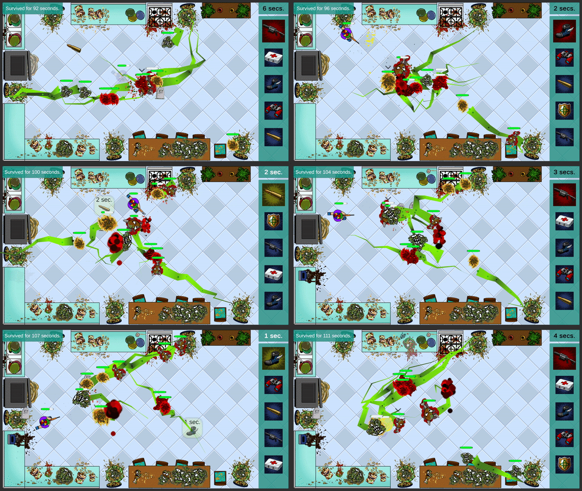
Since the theme was Out of control, and I always loved simulation and tycoon games, we ended up creating a game (which was actually a bit similar to an idea I was prototyping way back in 2015) where the main character is driven by a basic AI, and the only influence the player has over the character is to place powerups in specific points of the map. When a powerup is placed, the character will move towards it, so this gives indirect control over the character, otherwise, it always tries to move away from the enemies and will cut through them when cornered. Powerups stack up over time, but the monsters get tougher too.

Waste Waster Gameplay

If you are interested in how we created the game and what stages we went trough during development, you can check out the developer diary I recorded. Our youtube channel has also just been launched, so hit Subscribe if you want to get notified of new videos.


After the 48 hours period has ended we were left with 7 days to play and rate each other’s games. We got lots of feedback and rating and people seemed to love the idea. We got quite a few coverages by streamers playing games created during the jam too. Once the 7 days period ended we concluded with 92 ratings and made it into the top 100 most popular games of the jam. Mark then played the top 100 community-rated games and picked the top 20 he liked the most. You can watch his recap below.


We finished at an overall ranking at 973. out of the 5416 participants, which puts us in the top 20%, which is nice. The originality of our game was ranked 473, which is in the top 10%. Considering how unprepared we were to the jam and how much time we wasted on things we could’ve finished in a matter of minutes if we were more adept in using the engine, we were more than happy with the results.

If you want to check out the game you can give it a go here: https://overheadgames.itch.io/waste-waster

All the feedback and the final ratings can be found here: https://itch.io/jam/gmtk-2020/rate/695723

PSD Exporter is out + Double Deal event details

Exporting layered PSD files has been a feature on our todo list for a long time. We finally managed to get everything together and we are happy to announce that it’s now available in the program.

Once we realized we should be doing it we weren’t sure what would be the best way to release it. So we asked our Pro members, the veteran users of our software, to help us find the best way to make it available.

We received lots of feedback both on the distribution method and on the price (a huge thank you to everyone who participated in the survey), which we all took into account. We both wanted to keep it accessible to anyone who wants this feature at a reasonable price, and also reward users who’ve been long-time supporters. Taking every opinion into account, the Psd Exporter is going to be an addon on top of the Pro version.

To show our gratitude to our veteran members, anyone who already had the Pro version, have been gifted the Psd Exporter for free.

It would be unfair to anyone who wanted to buy the Pro version tomorrow to miss out on such a deal, so between 22 May and 7 June, we’ll be hosting a Psd Double Deal event! Buying the Pro version will automatically grant you the Psd Exporter for free! After this period expires, it’ll be available for purchase for $29.99, so if you ever wanted to do post-work on your characters, don’t miss this chance to unlock the true potential of the software! This is a one-time event we won’t be repeating in the future.

As an added bonus, we also created an Achievement for acquiring the Psd Exporter, which awards a free pack, as usual.

We hope you are as excited about the layered export as we are. We can’t wait to see all the creative ideas that you’ll come up with using the new options! If you happen to create a really cool character, post it on our forums so we can have a look!

Monthly Wrap-up: April

April has gone by and we’ve been busy building things we hope you will all enjoy. We hope you and your families and safe and healthy amidst the current situation.

Thankfully in the games and software industry, things didn’t change much. First, we kicked off the month with our 6th Birthday Sale, in which many of you participated. We also sent out a free pack to all our newsletter subscribers as a thank you for all the support we got since we launched. We also got a new logo, which we hope you like too. 🙂

We published two updates to ePic Character Generator during the month, where we fixed various issues. We focused a bit more on the Android version this month. After the introduction of Android 10, we noticed that saving files to arbitrary locations (for example the Documents folder) is no longer supported. Since they completely reworked how file access can be done, we spent over 20 hours trying to get this single feature alone right. But we couldn’t. Since the software is written in c++, and applications for Android are run in a Java environment, there are certain layers that are needed to enable communication between these two languages. Unfortunately, the way the new Storage Access Framework works on Android 10 and above is meant to be used by Java applications only, and passing a filehandle back to the native application to read and write the files is something that can’t be properly done without implementing extreme workaround which will also stop working once Android 11 is released. So after wasting so many hours on this, we decided to revert to restricting users to only be able to save and load to the app’s internal directory. We understand that this solution is not ideal, but it’s still a better way than disabling saving on mobiles completely.

Apart from that, we also started working on a very exciting and very frequently asked feature under the hood. To have a better understanding of what would be the best way to bring this new feature to you, we sent out a survey to our Pro members. Since they already have access to way more features than non-Pro users, and also they are our most dedicated supporters, we felt that they’d know best how to move forward with our idea. We received lots of great feedback and ideas which we’ll be able to use to launch this new feature. If you are a Pro member, we seriously suggest registering an account on our site to be able to receive specific communication from us, hear about new features we are working, and be able to communicate your needs and ideas so we can better steer the development of the software in a direction that would be the best for everyone. If you are a Pro member and haven’t yet completed our short survey, just launch the software and a message box would pop up offering the option to do so. We are working hard to take all your feedback in, and we hope to be able to launch the new feature by the end of the month.

We also received some questions asking what’s the best way to keep informed of all the stuff we are working on. The best way to keep updated is to be a subscriber of our newsletter, which we usually send once every 2-3 months. We also post monthly updates to our blog, share it on the project’s page, and on our developer hub. If you use Steam, make sure to follow us there too:
https://store.steampowered.com/developer/OverheadGames

You can also follow us on your favorite social media channel and keep in touch:
https://www.facebook.com/overheadgames/
https://www.twitter.com/overheadgames/

We are excited to see how you’ll like all the things we’ve been working on once they are rolled out.

Stay tuned!

Monthly Wrap-up: January

Among many other changes, we decided to start writing monthly wrap-ups, to look back on what has happened in the past month and summarize the most important bits of it. This is also exciting for us so we can actually see how many things we were able to achieve compared to what we planned, but hopefully it’d also provide some more insights on how we do things and what we are working on currently.

January has mostly been consumed by the process of transitioning to the new website. Our old one was created in 2013 at around the same time we launched our Indiegogo compaign for ePic Character Generator, mainly to provide a place to connect with people interested in what we were doing. The Forums were a good place to engage in conversation with us and the others, and it proved to be a very valuable tool for us, as we often got feedback which we were able to take into consideration when we needed to decide what to do next. Oftentimes we get bug reports which also help us tremendously in figuring out what’s working as intended and what’s not. A huge thanks to everyone who’s keeping a constant eye on the health of the software and letting us know whenever something bad happens!

After the release of the software the website operated as a shop, as it was the only place the generator was available. As we ported the software to Steam in 2015 we needed to add many extra functionalities to the site which helped new users get started quickly, like the FAQ page. We also created a Showcase section and started developing a Profile page, so users can easily manage their collections and exchange free packs to the ones they are interested in using the most.

The site worked okay for several years, but last year we started focusing on moving forward, and examined several factors in how we are presenting ourselves to the market. Our old site was based on Joomla, which was a quite popular CMS back in the days, but it grew old over the years, and we had a very hard time getting it to do what we wanted to do with it. We spent months on trying to get everything right on that, but in December, 2019 we realized we can no longer stick to keeping it, so we decided to transition to a new site based on WordPress, which is one of the most popular CMS today, with tons of plugins and addons available on the market.

We knew that migrating the site would not be an easy task, as this essentially meant that we’ll need to rebuild everything from scratch. Luckily we found plugins to be able to put together the existing functionality, as we needed to provide a way for users to register and log in, to be able to purchase packs, and to have a forum where discussions can carry on. As of now, we are quite happy with the results, but we also know that the site is far from finished. We still have plenty of areas we need to improve both visually and functionally. We also spent a significant amount of time on optimizing and caching, so load speeds would be more ideal, but this topic is also something that can continue on forever.

Although most of the time in January was spent on the website, we were also able to focus on the software a bit. We faced an issue on Google Play with devices using Android 10, as they are no longer able to download expansion files. We filed a bug report with Google and they are investigating the issue. We also received several feedback mostly from mobile users that linking accounts are rather difficult, so we improved how the linking flow works and today account linking both on Steam and Google Play are 95% automatic.

We were also able to spend some time on our next project. We know that finding the right setting for it was a crucial first step, so we did some research on what settings are trending, but the market is still not yet overwhelmed with different titles. We are pretty happy with the results, and we now have a basic introduction to the world it’s going to be placed in. We know this sounds exciting, but we can only reveal more details on it just a bit later.

In February we expect to flesh out most of the remaining issues with our website, as well as to deliver an update to ePic Character Generator and fix some of the known bugs.

Why developing tools for small projects worth it?


ePic Character Generator has been out of the door for a while and a heavily reworked version has seen sunlight in November, 2015. We’ve had quite a few improvements on the program and lots of new content is now available, but I would like to take the time to talk a bit about how the actual packs are being put together in the background. If you don’t know this program yet, it’s a character generator software where anyone can create high quality images without any artistic skills, export the pictures on transparent or static backgrounds, save them as tokens or character cards, and use them freely for role playing, illustrating stories, prototyping ideas or releasing actual games with the images. Now let’s get a bit into how this works behind the scenes…

The way the program works is fairly simple. It parses a config file, which defines what layers the currently active package has and then renders the items from each layer on top of each other in the given order. There are plenty of parameters to specify for each layer:

[
Name = “pants”
Subcategory = “Outfit”
IgnoreItem = “fullset fullset2 suit suit2 extreme”
Colorable = “1”
SkipIgnoredRandom = “1”
ItemCount = “34”
]

– This is how the pants category is defined in the pack’s config file. It tells what the name of the category is, which is useful to display the button for it.
– It tells what Main category it goes, which is the Outfit. Every category is grouped in Main categories thematically (the Outfit has most of the stuff which just goes on the character, but doesn’t change it, like eyes, hair, tatoo, etc…).
– The IgnoreItem is an array itself, it lists all other categories which should be turned off when this category has an active item.
– The Colorable means you can change the color of that item.
– ItemCount represents the number of items in this category.

It’s quite straight-forward, although there are a lot more parameters in the config which we should also keep track of. In Season #1 each pack provided everything it needed, and every pack was different. Changing to Season #2 we’ve changed the fundamental approach of how we use packs. Now we have base packages (currently three) which doesn’t have any content besides of a base body image. All other packages are extensions of this base package, adding more items in each category, which results that the user can mix and match the content of every pack released to that base package. This approach gives the users a lot more flexibility over their characters, but also forces us to produce more in numbers and smaller in size thematically focused packages.
We’ve also introduced a couple of new ways to improve overall quality in the characters. For example, we’ve split most of the categories to two, one for the front of the item, and one for the back. We can then easily define which parts of the item should go to the back of the character, and what should be visible in the front. We’ve also added the toggle feature, which enables the users to swap the location of items, companions, effects in front of, or behind the characters, which are also defined by adding new categories marking alternative positions in the rendering order.

In Season #1 the workflow looked like this:
1: Our artist exported all the images to folders and notified me that they were done.
2: I opened every folder and manually entered the number of items in them.
3: I’ve started the icon creator mini app I wrote, which opened each image one by one, where I was able to mark the rectangle I would like to save as an icon for each item.
4: We’ve then tested the content, iterated over it, and when we were happy…
5: I run the data file maker to produce the final pack file, which holds all of the assets in a single file.

This is how the icons looked in Season #1:

s1_icons

Most of the Season #1 packages contained between 12-15 categories, so it was a bit of a pain and a bigger time investment to get the content from being exported to actually testable in the program. In Season #2 we’ve grown a lot bigger. We’ve had between 24-38 categories per pack. That would be a lot of counting! So I figured I would be better off creating a small tool that can generate the package from the exported images. It started out slowly, but grown steadily as we progressed over the course of development.

This is how the workflow looks now:
1: Our artist exports all the images.
2: She can run the package generator program with a command line argument specifying what pack she would like to process, what is the base package for the given pack, and in which theme it should belong. The program then creates the folders and configs, copies the images, makes the necessary optimizations and creates the icons.
3: The new package is usable in the program.

I don’t really want to talk about most of what the package generator does, but I would like to spend some time to explain the icon generator, as I think this is the most exciting bit. As we are facing the challenge of being able to figure out what is the most interesting part of every item simply by looking at it, what should be taken out and represented on a 148×124 pixels square so the user can easily recognise the item and decide on whether they want that item on the character or not, without clicking it first and seeing it equipped.

The icons are made by looking at the image and finding the smallest rectangle the item can fit into. Then some logic is applied over it to decide how big the item can be on the icon, or how far should it be zoomed out. Some extra parameters were added in each config template to make it clear for the program what to do:

IconAlignment = “Center”
IconMinIterations = “2”
IconMaxIterations = “3”
IconSize = “Full”

– IconAlignment will define the alignment of the item relative to the middle of the icon.
– IconMinIterations will specify how many times the algorithm should zoom in/out at least on the image before finding the right spot.
– IconMinIterations will specify how many times the algorithm is allowed to zoom in/out on the image before finding the right spot.
– IconSize sets what should be visible on the icon from the item. Full means the item should be visible as a whole.

I’ve also figured that adding the base body to the icons would make them appear in context, but this raised some other issues, as the generator now should have an understanding of the relation of the categories with each other. Should the item be in front, or in the back of the body? Does it have a back part which should also be visible on the icon? Does it applies some transparency over the body at some point, like peg legs or minotaur bottoms?

This is how the icons look in Season #2:

s2_icons

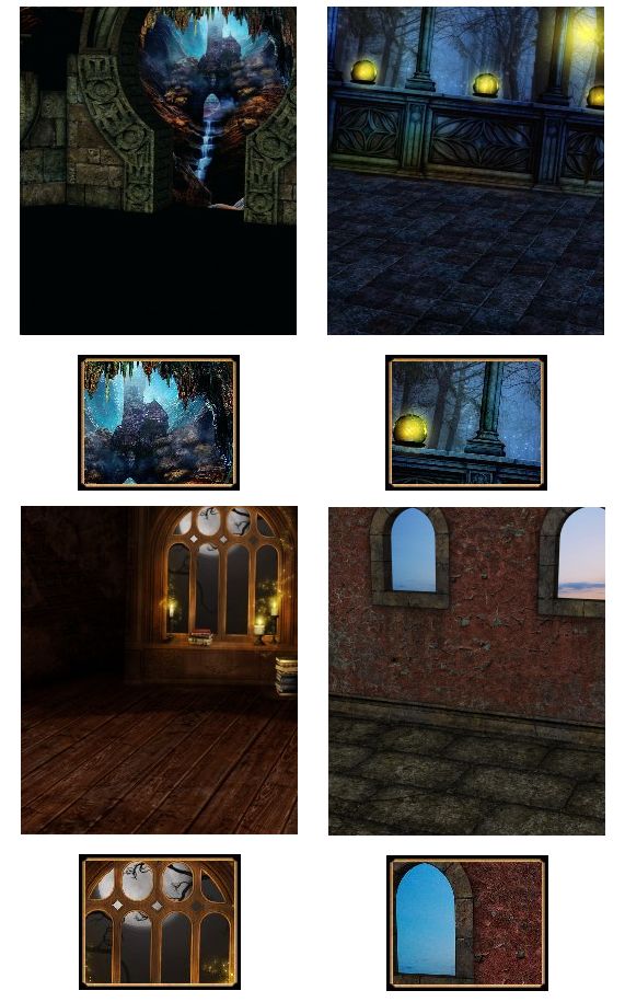
The above got most of the items right, but the most interesting part was to identify what the icon should display for a background, as it fills the whole image there was no way to crop it easily. I went with a very simple approach. I divided the image to equal cells and calculated the variety in each of the cells individually. The variety has been produced by calculating an average for each pixel in the given cell, then comparing each pixel with the calculated average resulting in either a positive or negative change in the score. The cell with the highest variety got selected as the most interesting part of the image. I then extended it to treat neighbouring cells as one and compare the overall scores with the others, providing higher resolution to be displayed on the icons.

background_icons

Overall creating this tool has been a bit time consuming, but it works out very well, and with every new pack the time not spent on fully automatable tasks pays off greatly. It might seemed like a small win compared to how much time would it require to create an initially working tool, but as we moved forward it turned out to be really handy, especially when we’ve started iterations on multiple packs and ended up moving items between them. We could’ve kept track of the moved items manually and change the counts, copy the images and the icons, but it was so much faster running a .bat file which did everything for us. We’re currently focusing on delivering the Android port of ePic Character Generator, as well as adding new packages to the store.

If you are interested check out the program:
https://epicgenerator.net/

Thanks for reading!