Forums › ePic Character Generator › Chit Chat › General feedback › Finished Projects › New Gui
- This topic has 12 replies, 3 voices, and was last updated 11 years ago by
sade.
-
AuthorPosts
-
September 23, 2014 at 9:43 pm #21044
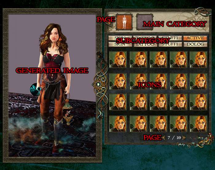
Its a very early wip about the new gui. many things are missing, and contains alot of placeholder, but it gives an image how i plan it.
comments and suggessions are very welcome
 September 25, 2014 at 11:33 am #21045
I suggest that you make all the icons and buttons the same size, so page turning button, main category button, the subcategories and the thumbnails.
I liked the old subcategory pictures, it was easy to choose with the icons.
Can you do two versions of the subcategory icons, one with only picture and one with picture and title? To see which one is better.The bigger subcategory icons would push the thumbnails lower, because I think the bottom of the thumbnail field should align with the bottom of the generated image.
Also if you have the navigation icons on top, in big, you don’t need the small arrows on the bottom. The page numbering is nice there, but no small triangles.
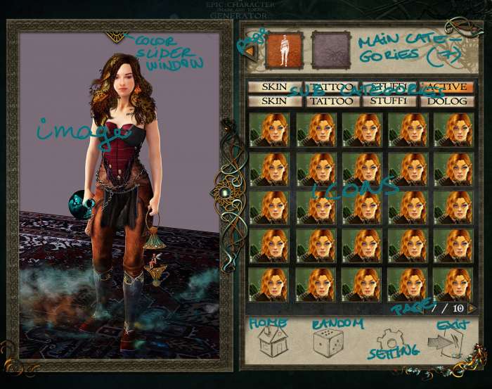
September 25, 2014 at 11:49 am #21046I’m pretty sure the big arrows are meant to browse through the main categories while the small ones allow browsing through several pages of the same subcategory.
Now my understanding of the interface may be mistaken, granted. 🙂
September 25, 2014 at 6:19 pm #21047I misunderstood the picture, and wrote some dumb things,
so Sade asked me to translate:
– Top row is what was under the thumbnails in old version, but more icons.
– Subcategory is the vertical icons from previous version, but again, more icons.
-Under the thumbnails comes the utility menu, save, etc.– That’s why uniform size icons is not feasible. Main category is gonna be pictograms, subcategory is only title, to separate the two things, make them different, otherwise it would be too chaotic (and IMHO ugly)
– Subcategories cannot be pictograms, because of place constraints, because main category is gonna be 7 items instead of 5, with a variable number of subcategories. For example body category will have 12 subs (with the added benefit of being able to make more unique, and different looking characters)
But if you want it, subcategory can be made vertical, just like in the old version.
The most important thing is, that the new UI will be full-screen, that has to function from 800×600 to widescreen 1900+ monitors. That’s why the main category will have arrows for scrolling the icon bar when the resolution demands, and won’t have when they are not needed.
The bottom pagination navigation is absolutely necessary, because you will have several dozens of choices for anything from body hair to clothing.
September 26, 2014 at 2:17 am #21048Appears coherent to me.
October 1, 2014 at 9:22 pm #21057blue or brown? (from this missing the ornaments, its just the base, sorry)
 October 1, 2014 at 9:33 pm #21058
Ouchie.
Well, if your latest post is brown, that would mean the first one is blue…
Then, my answer would be Blue.
Did I answer that one correctly ? 😛
October 1, 2014 at 9:40 pm #21059thank you! i like it more too! just i was unsure, because greg told its too chaotic, and he didnt know what is what. perhaps if i finished it, and not just put placeholders, it will be better 😀
October 2, 2014 at 12:49 am #21061what do you think? (click2zoom)
 October 2, 2014 at 1:50 am #21062
Last version is very good.
Has all the things I really like, like the adornments on the frame.And, I’m all for the new bottom menu, I almost said I don’t like the brown version just because of the big random button, but this one is really good.
Oh and everything is ordered, in rows and columns, Greg approves. 🙂
(I think I’m a bit paranoid, because first I thought Sade is writing all the explanations on the picture just so Greg won’t mix it up again)
October 2, 2014 at 1:54 am #21063Just one question, that came up looking at the brown version:
How wide are the parts of program, on an 1920×1080 wide monitor?
If I go full screen, is the width of the right hand side with the icons fixed, and just the picture preview grows, or both sides?
Can we resize the window, or just normal and full screen?October 2, 2014 at 2:05 am #21064as i wrote we make the gui with bandy its works perfect on any screen resolution.
the question is how? the answer is not fixed, but tileable frame.. the right side will use
the extra place with extra column, row, etc.
i think the resize shouldnt be problem, and the full screen neither.
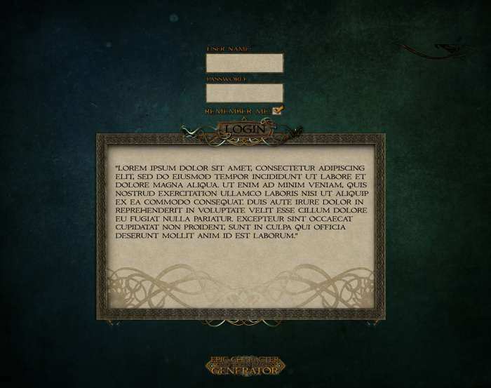
im happy you all like it. i have a new, cool idea for the main menu 😀October 10, 2014 at 2:57 pm #21067login screen. if you set it autologin, you will see this screen only the first time
-
AuthorPosts
- You must be logged in to reply to this topic.