ePic Character Generator has been out of the door for a while and a heavily reworked version has seen sunlight in November, 2015. We’ve had quite a few improvements on the program and lots of new content is now available, but I would like to take the time to talk a bit about how the actual packs are being put together in the background. If you don’t know this program yet, it’s a character generator software where anyone can create high quality images without any artistic skills, export the pictures on transparent or static backgrounds, save them as tokens or character cards, and use them freely for role playing, illustrating stories, prototyping ideas or releasing actual games with the images. Now let’s get a bit into how this works behind the scenes…
The way the program works is fairly simple. It parses a config file, which defines what layers the currently active package has and then renders the items from each layer on top of each other in the given order. There are plenty of parameters to specify for each layer:
[
Name = “pants”
Subcategory = “Outfit”
IgnoreItem = “fullset fullset2 suit suit2 extreme”
Colorable = “1”
SkipIgnoredRandom = “1”
ItemCount = “34”
]
– This is how the pants category is defined in the pack’s config file. It tells what the name of the category is, which is useful to display the button for it.
– It tells what Main category it goes, which is the Outfit. Every category is grouped in Main categories thematically (the Outfit has most of the stuff which just goes on the character, but doesn’t change it, like eyes, hair, tatoo, etc…).
– The IgnoreItem is an array itself, it lists all other categories which should be turned off when this category has an active item.
– The Colorable means you can change the color of that item.
– ItemCount represents the number of items in this category.
It’s quite straight-forward, although there are a lot more parameters in the config which we should also keep track of. In Season #1 each pack provided everything it needed, and every pack was different. Changing to Season #2 we’ve changed the fundamental approach of how we use packs. Now we have base packages (currently three) which doesn’t have any content besides of a base body image. All other packages are extensions of this base package, adding more items in each category, which results that the user can mix and match the content of every pack released to that base package. This approach gives the users a lot more flexibility over their characters, but also forces us to produce more in numbers and smaller in size thematically focused packages.
We’ve also introduced a couple of new ways to improve overall quality in the characters. For example, we’ve split most of the categories to two, one for the front of the item, and one for the back. We can then easily define which parts of the item should go to the back of the character, and what should be visible in the front. We’ve also added the toggle feature, which enables the users to swap the location of items, companions, effects in front of, or behind the characters, which are also defined by adding new categories marking alternative positions in the rendering order.
In Season #1 the workflow looked like this:
1: Our artist exported all the images to folders and notified me that they were done.
2: I opened every folder and manually entered the number of items in them.
3: I’ve started the icon creator mini app I wrote, which opened each image one by one, where I was able to mark the rectangle I would like to save as an icon for each item.
4: We’ve then tested the content, iterated over it, and when we were happy…
5: I run the data file maker to produce the final pack file, which holds all of the assets in a single file.
This is how the icons looked in Season #1:
Most of the Season #1 packages contained between 12-15 categories, so it was a bit of a pain and a bigger time investment to get the content from being exported to actually testable in the program. In Season #2 we’ve grown a lot bigger. We’ve had between 24-38 categories per pack. That would be a lot of counting! So I figured I would be better off creating a small tool that can generate the package from the exported images. It started out slowly, but grown steadily as we progressed over the course of development.
This is how the workflow looks now:
1: Our artist exports all the images.
2: She can run the package generator program with a command line argument specifying what pack she would like to process, what is the base package for the given pack, and in which theme it should belong. The program then creates the folders and configs, copies the images, makes the necessary optimizations and creates the icons.
3: The new package is usable in the program.
I don’t really want to talk about most of what the package generator does, but I would like to spend some time to explain the icon generator, as I think this is the most exciting bit. As we are facing the challenge of being able to figure out what is the most interesting part of every item simply by looking at it, what should be taken out and represented on a 148×124 pixels square so the user can easily recognise the item and decide on whether they want that item on the character or not, without clicking it first and seeing it equipped.
The icons are made by looking at the image and finding the smallest rectangle the item can fit into. Then some logic is applied over it to decide how big the item can be on the icon, or how far should it be zoomed out. Some extra parameters were added in each config template to make it clear for the program what to do:
IconAlignment = “Center”
IconMinIterations = “2”
IconMaxIterations = “3”
IconSize = “Full”
– IconAlignment will define the alignment of the item relative to the middle of the icon.
– IconMinIterations will specify how many times the algorithm should zoom in/out at least on the image before finding the right spot.
– IconMinIterations will specify how many times the algorithm is allowed to zoom in/out on the image before finding the right spot.
– IconSize sets what should be visible on the icon from the item. Full means the item should be visible as a whole.
I’ve also figured that adding the base body to the icons would make them appear in context, but this raised some other issues, as the generator now should have an understanding of the relation of the categories with each other. Should the item be in front, or in the back of the body? Does it have a back part which should also be visible on the icon? Does it applies some transparency over the body at some point, like peg legs or minotaur bottoms?
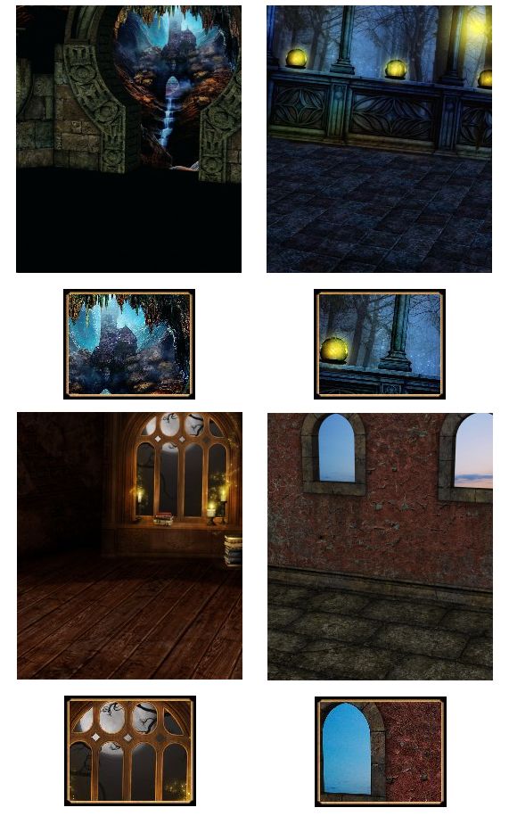
This is how the icons look in Season #2:
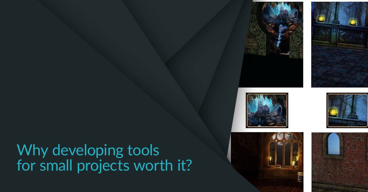
The above got most of the items right, but the most interesting part was to identify what the icon should display for a background, as it fills the whole image there was no way to crop it easily. I went with a very simple approach. I divided the image to equal cells and calculated the variety in each of the cells individually. The variety has been produced by calculating an average for each pixel in the given cell, then comparing each pixel with the calculated average resulting in either a positive or negative change in the score. The cell with the highest variety got selected as the most interesting part of the image. I then extended it to treat neighbouring cells as one and compare the overall scores with the others, providing higher resolution to be displayed on the icons.
Overall creating this tool has been a bit time consuming, but it works out very well, and with every new pack the time not spent on fully automatable tasks pays off greatly. It might seemed like a small win compared to how much time would it require to create an initially working tool, but as we moved forward it turned out to be really handy, especially when we’ve started iterations on multiple packs and ended up moving items between them. We could’ve kept track of the moved items manually and change the counts, copy the images and the icons, but it was so much faster running a .bat file which did everything for us. We’re currently focusing on delivering the Android port of ePic Character Generator, as well as adding new packages to the store.
If you are interested check out the program:
https://epicgenerator.net/
Thanks for reading!

